How to use Lightroom to bring a picture back to what the eye saw
[perfect_quotes id=”754″]
The camera doesn’t capture what the eye sees, the camera doesn’t even capture what is actually there ! The eye sees roughly 20 stops from darkest to lightest while the best cameras are capturing about 7 stops total between darkest and lightest. In this first frame the orange trees are exposed correctly, but that the sky is blown out and details are lost in the clouds.

However in this next exposure which is 2 stops less

There is now detail in the sky. The blue is a little off from what we expect, and of course all the trees are way too dark.
Even from the normal exposure with the blown out sky, the green trees are too dark and lost from the photo. Looking at this next frame

the trees can now be seen but we have lost contrast, and they are slightly over exposed.
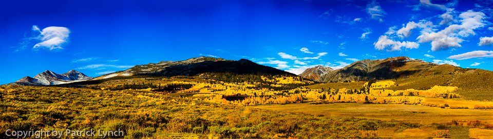
Looking at all three photos together (below) we can see that we want some of each of them.
I have mentioned before that I use Photomatix to combine the exposures. Usually it works pretty well with a default of ‘photographic’ that you can see below

As you can see the clouds are still blown out, the sky is to bright, and the yellow aspens are a little too much over the top. The image below is better with a slight tweek of the Photomatix settings.
 Let’s use this image as out starting point to create what the mind’s eye remembers. Big things to fix, more will become apparent as we work on the image:
- blown out clouds
- trees are too orange, need to be yellower
- sharpening
I work from the large or global aspect down towards the fine details. In this case, in Lightroom I start out with
- Move the highlights slider to the left until it is about -75. This yields a huge improvement in the sky.
- Next the trees are a bit too dark, so I use Luminance in the HSL area to lighten the greens, reds, yellows, and oranges.
- Still in HSL Luminance, darken blue a little bit for the sky.
- In HSL switch to Saturation and increase yellow, and orange
- Go back up in the LR panel and use the Clarity slider. Not too much or the whole feel of the pic changes (try it sometime).


The color balance seems a little off as it gets displayed for web rather than the AdobeRGB 98 color space.
Agree... Leave a comment, disagree leave 2 comments