Moving from a capture to an image
My intention is to write a series of posts (hopefully others will too) on the process of moving from an image capture to an image that is ready for presentation..
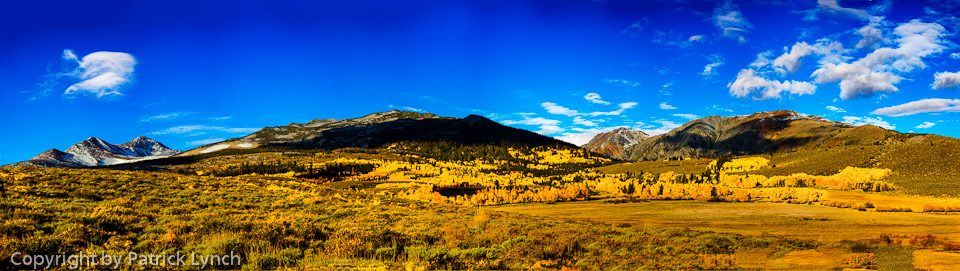
Here is the finished image. It probably needs a little bit more such as removing the ducks in the foreground, and cropping to remove some of the sky.
In this post I take a bland, low contrast image of Mono Lake and pep it up a bit. Below is the original image in both color and Black & White.
 This image suffers from low contrast which makes it unappealing. What was required were a series of steps to provide more variation across it. Below is the final image (before converting to BW).
It looks a little bizarre in color, but works nicely in B&W. I originally worked the image in LightRoom (LR) but decided that it really needed Photoshop for the operations that I had in mind.
Below are some of the thoughts:
- My intention was to increase the gradations or color spectrum in each of the major areas of the photo (water, rocks, mountains, sky)
- Add contrast via sharpening with a large radius
- Provide increased depth by having different levels of gray for each of the major areas
Here is the process that I used:
- Brought it into Photoshop
- Converted to LAB color space
- Made and save selections for each of the following areas to allow me to work with each of them independent of the others.
- Water
- Rocks
- Mountains as a whole
- Front left mountain
- For each of the selection areas I created a curves layer. In LAB color space I can change the brightness or lightness (the L of LAB) independent of the color which I can’t do in standard RGB color space.
- I put a Hue & Saturation layer at the top of the layers with saturation set to 0 (zero) to convert to black and white. This allowed me to see in B&W the changes that I was making in the color relm.
- For each of the Curves layers I increased the Lightness contrast (to differing degrees) making the darks darker, and the lights lighter, spreading the spectrum of what was there.
- For each Curves layer, I also increased the color range or spectrum to (actually amplified the differences by changing the scale). This involves changing the A and the B histogram curves.
- Finally I ran an Unsharp mask against the whole combined image to increase both the sharpness and to increase the contrast.
If you have specific questions, post a comment and I’ll respond.
Agree... Leave a comment, disagree leave 2 comments