Tutorial: Post Processing – 2
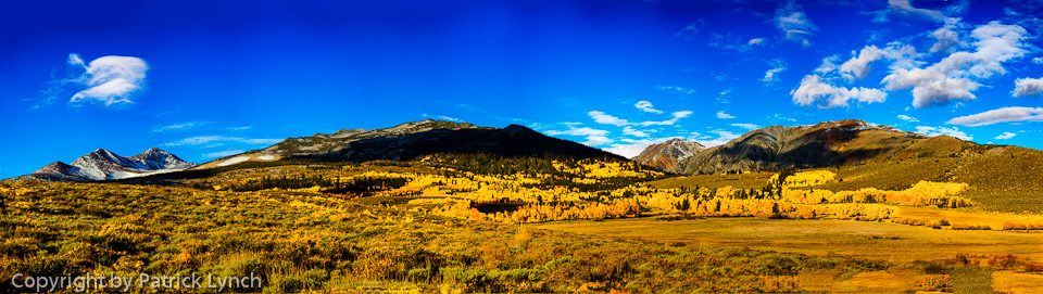
 This image of Mono Lake was captured on the drive to the Fall Colors workshop. This is about what my minds eye saw, but certainly not what the camera saw.
Below is the normal exposure frame of a triplet prior to the HDR run.

Looking at this image there are a number of things that jump out as needing attention.
- Composition needs some work via cropping
- There is a spot in the upper left that needs to be removed
- The sunlight in the foreground isn’t as vivid as I remember
- The peaks in the distance go grab you like they did in real life.
Luckily all of this can be dealt with in Lightroom without having to resort to Photoshop.
Below is the image after it comes out of the HDR process.
 There is some improvement in this….
- The foreground has some yellow in it from the low angle sun
- the clouds have a little more contrast
However there is still quite a bit that needs to be done. I get rid of the spot, just because it bothers me.
The first attempt is to use a gradient filter in Lightroom. After playing around

YUCK – not what I wanted. However, it brings out an important point; it may not be immediately obvious as to what the right approach or the right tool is to accomplish the goal. This failed gradient attempt made it clear to me, the reason I took the photo was because of the mountains in the distance.
I chose the adjustment brush and increased the exposure, decreased the saturation, and painted the mountains. The eye tends to gravitate to light, or bright places in an image, this is great if it is where you want the eye, but it can also cause problems. This was a case of making things lighter, brighter.

This is starting now to resemble what I want.
I add a little vibrance and clarity slider to the image and … still not quite right.
The yellow sunlight in the foreground isn’t there enough and the blue sky is too light.
Next up are the HSL (Hue, Saturation, Luminosity) sliders. These are great, particularly the Luminosity slider. In this case, slide the Blue slider to the left making the sky darker. Then I slide the yellow slider to the right to increase the lightness of the low angle yellow rays.
Decreasing the blue Luminosity is a great trick for the sky. I noticed in the conversion to jpeg for this post that the blue became over done (like the gradient). It does not have look that garish; try it yourself.
I decided not to crop.
Agree... Leave a comment, disagree leave 2 comments